GoodReads
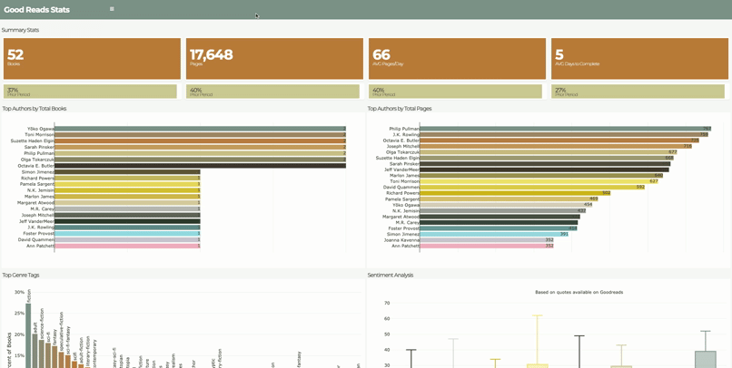
As an avid reader, Spotify’s Year in Review feature inspired me to see what I could learn from my own reading habits. I found that goodreads.com has an API where I could access my reading data. Analysis included year-over-year comparisons, reading pace, top genres, top authors, and sentiment analysis based on quotes from each books. Additionally, I learned that parsing XML is not for the faint of heart.
BayesAB Testing
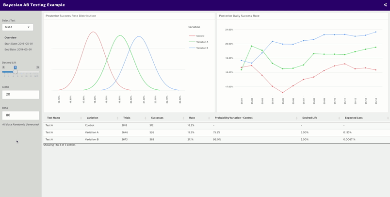
The dashboard design is intentionally generic to allow for “success” to be uniquely defined for each test (conversion, retention, behavior, etc) but still fed into a consistent UI. A user can select from a list of tests, adjust priors, and the desired lift. Implementing a Bayesian approached, using the BayesAB library, allowed for results to be a bit more interpretable to end users not as versed in a more classical approach - at least I found great success communicating results this way.
All data randomly generated
TidyTuesday: San Francisco Trees
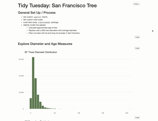
While attending rstudio::conf in January 2020, I learned about a mapping library mapdeck and I wanted to give it a try. Coincidentally, TidyTuesday had recently released a dataset on trees in the San Francisco area. The data included a variety of features about the trees including lat/long geolocation. Perfect!
Summary Dashboard
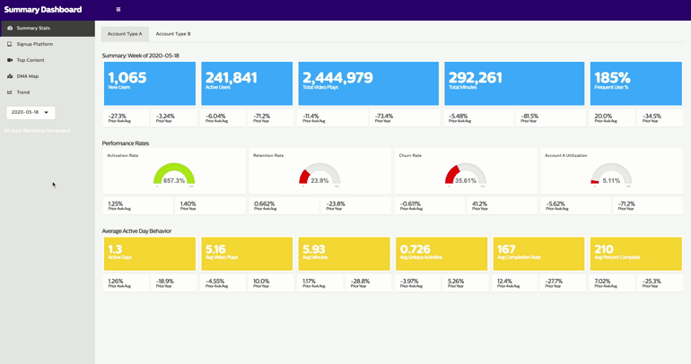
The primary purpose of this dashboard was to provide “state of the union” metrics across an organization so conversations can all be speaking from the same playbook. Historic data, prior period comparisons, trends, and geographic visualizations features were also include in the Dashboard. The repitition found in UI elements provided a perfect chance to implement shiny modules as a way to write more efficient and easy to understand code.
All data randomly generated